SP Full Logo

Brand Guidelines

Logo

Our new logo goes back to our roots. Back to the silicon board our company started with.
As it expands and collapses between the full and condensed logo, it changes size with the amount of data contained within it, just like our products!
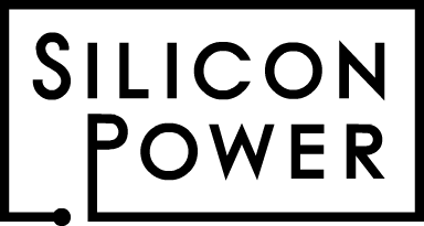
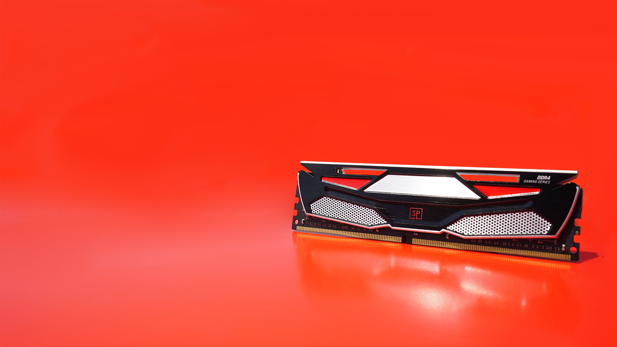
SP changing logo

Full Logo

This is our brand signature. It’s the first thing you see on the landing page of the website, on the packaging, etc.
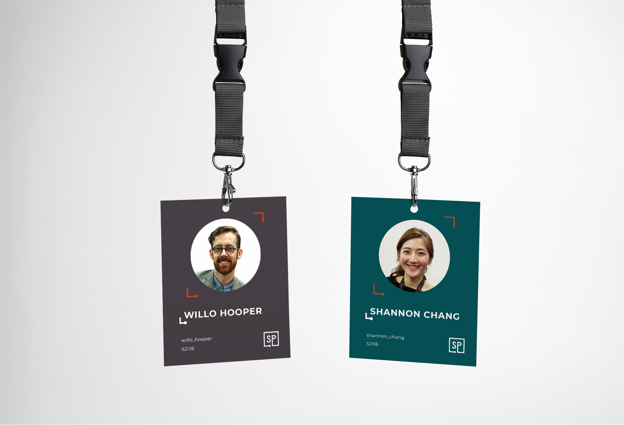
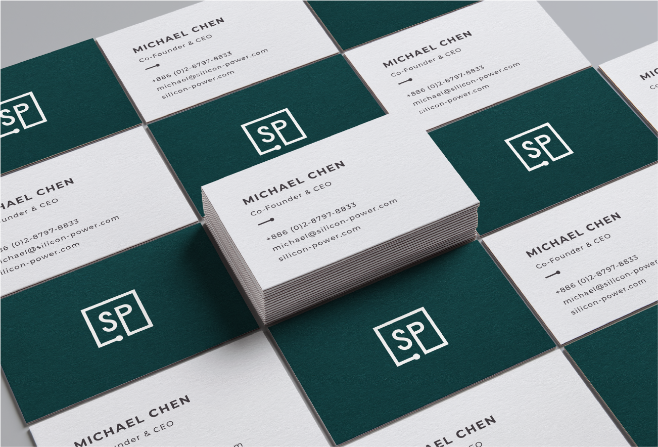
SP full logo

Condensed Logo

This will be used much more than the full logo. As soon as you scroll on the website, the full logo reduces down to SP. It is seen as a lockup alongside product names, on social media, on ID cards - everything SP.

SP full logo

Typefaces

Headings Fig.1

H1 Montserrat Bold Caps (Kerning 80pt)
H2 Montserrat Light Caps (Kerning 80pt, half pt size of H1)
H3 Montserrat Bold (Kerning 80pt)

Bodycopy Fig.2

Montserrat Bold
Montserrat Light

Fig.1

H1 Heading

H2 Heading

H3 Heading

Fig.2

Bold Bodycopy

Lorem ipsum dolor sit amet, consectetuer adipiscing elit, sed diam nonummy nibh euismod tincidunt ut laoreet dolore magna aliquam erat volutpat. Ut wisi enim ad minim veniam.

"Lorem ipsum dolor sit amet, consectetuer adipiscing elit, sed diam nonummy nibh euismod tincidunt ut laoreet dolore magna."

Color

Primary Palette

SP Green

Main background colour for header pages.

SP Grey

A warmer alternative to black, to be used for backgrounds and text on infographics.

SP White

Clean, bright background colour.
Text over Primary Palette backgrounds and dark images.

SP Green

  • C 92
  • M 50
  • Y 55
  • K 31
  • R 5
  • G 84
  • B 89
  • #055459

SP Grey

  • C 66
  • M 64
  • Y 56
  • K 44
  • R 70
  • G 64
  • B 69
  • #464045

SP White

  • C 0
  • M 0
  • Y 0
  • K 0
  • R 255
  • G 255
  • B 255
  • #ffffff

Secondary Palette

SP Red

Use Sparingly. For content framing and highlights.

SP Blue

Use Sparingly. For links and CTAs.

SP Red

  • C 7
  • M 91
  • Y 97
  • K 1
  • R 222
  • G 60
  • B 41
  • #de3c29

SP Blue

  • C 64
  • M 23
  • Y 0
  • K 0
  • R 69
  • G 164
  • B 264
  • #45a4ea

Graphic Elements

Brand Continuity

Whether you’re looking at a webpage, product packaging, or an ID card, all the icons, buttons and page furniture link back to the logo in their composition.

SP Icons

Imagery

Style

A clean, welcoming photography style that embodies our three keywords: expert, reliable and human-centric.

Product Photography

Product photography should have full focus on the product itself, with few distractions surrounding it. A simple textured/coloured background that compliments the product and its concept.

Lifestyle Photography

Lifestyle photography should include people where possible, using the product and representing the demographic we’re targeting.

Our Brand in Action